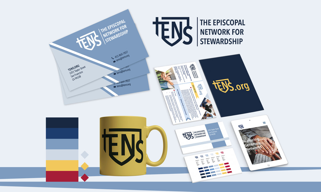
 A strong brand identity offers assets that make it easy to create consistent printed materials and digital graphics; the result is wide spread recognition among constituents. With a guide that includes color, shapes, and design examples, an organization or company can feel confident that their hard earned brand will not become watered down as it used by designers and others over time. The work we recently did on the TENS rebranding is a great example of how this works. The Episcopal Network for Stewardship works to provide training, encouragement, nurture, and support to the broader Episcopal community by offering resources and tools for download from their extensive online library. Upon his appointment, new Executive Director Davey Gerhard, decided it was a perfect time for a brand refresh and asked me to take on the project. We start all logo/brand re-designs by asking a lot of questions and from these I extrapolate the phrases and words that are used most often. In the case of TENS, we heard a lot of talk about "connection", "networking" and "generosity." When discussing how they wanted the logo to look, phrases that included "modern", "not busy", "flexible", and "like the episcopal shield" were tossed around consistently. From these conversations we started sketching and went through several versions and concepts before finalizing a design that satisfied the needs of the board, staff, and constituents. The goal of the TENS logo is to make the connection between faith, connection, tradition, and generosity while conveying a sense of modern competency and confidence. Here is a breakdown of the meaning behind the TENS logo mark. 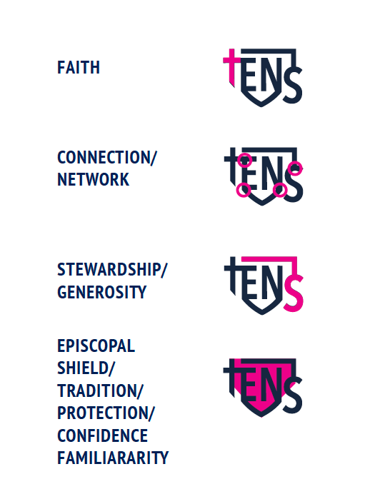 The logo mark could be "locked up" in any number of configurations depending on the space allotted. The preferred lockup is the mark to the left and a dividing rule separating from the type treatment on the right, however, other lockup combinations can be used including a website version space is particularly limited.
The color choices for TENS are as important as the logo itself and are an intentional part of its personality. We established four primary colors in shades of blue and two secondary colors for contrast and emphasis. A mood board does a great job of showing how these colors come together to form a cohesive brand.   Our font choices are a simple yet elegant sans serif (PT Sans) and a rounded serif (Merriweather) - both easily accessibly via google and adobe to allow consistency among the many constituents using the branding. In addition to color and fonts, we also developed icon and graphic element usage suggestions - all elements should reflect the logo mark with triangular edges, diamond shapes, and ribboned ends. Image boxes can be shaped to reflect these design elements. Whenever possible we try to avoid circles and ellipses. 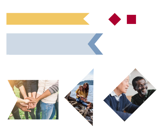 The importance of a brand guide for creating a way to maintain consistence over all outlets for marketers, publicists, accountants, and other designers cannot be underestimated. Do you have one?
0 Comments
|
AuthorCori Kesler 
Archives
June 2022
Categories |

 RSS Feed