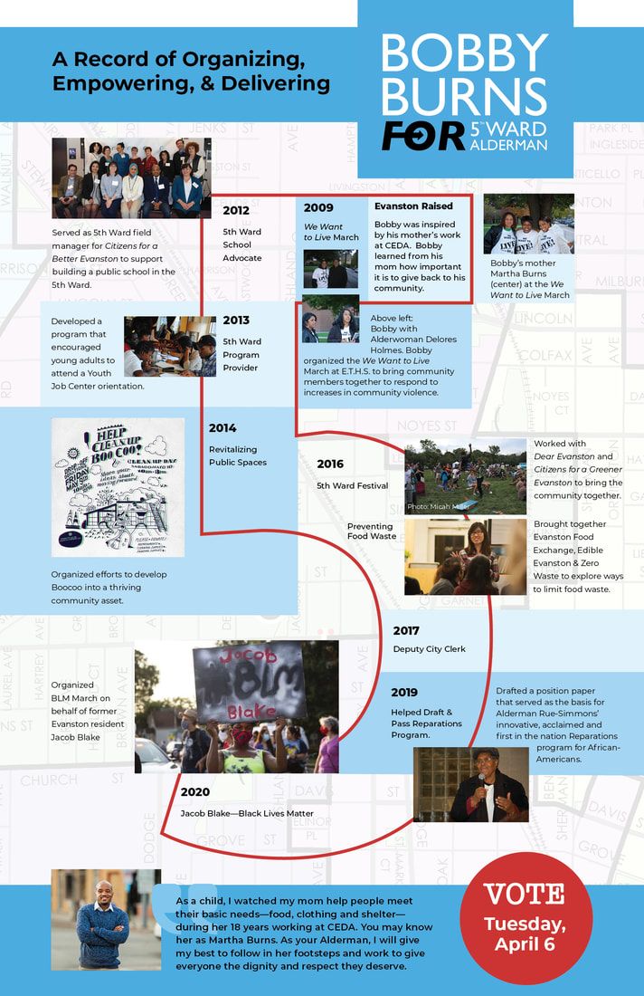
 For the past several years, my client Green Alley Strategies has been submitting select pieces of our direct mail collateral to the American Association of Political Consultants (AAPC) yearly Pollie contest. Results have been encouraging - we've won something every year we've entered and 2022 wasn't different. The conference took place a couple of months ago in Puerto Rico and I hear it was a beautiful venue. We were happy to receive a Silver Pollie in the category of Regional-Candidate Division, AAPC North, Silver "All Over This Map" - Direct Mail; Local/Municipal-Small Budget Campaign. This is an 11x17 sheet folded in half to 8.5x11 with a mailing panel on the back, but the star of the show was the centerfold which literally mapped out everything that the candidate, Bobby Burns, had done for the district up until this point. His work is impressive when illustrated this way. 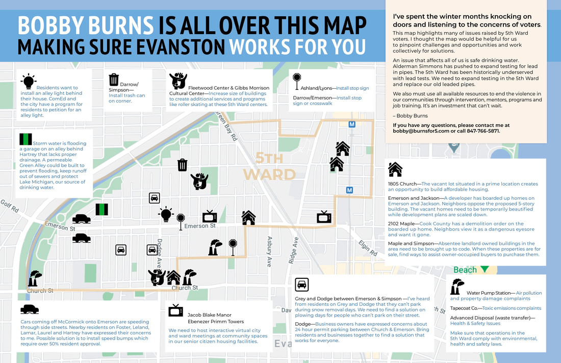 It's interesting to see what the Pollie committee values in a mail piece. If you're interested you can view them here but a warning: you have to do a lot of clicking to see the different pieces - they don't make it easy.
It's fun to win awards, but I sometimes wonder whose back is being patted and if it's not just a whole lot of self congratulatory flattery. 🤷🏻♀️
0 Comments
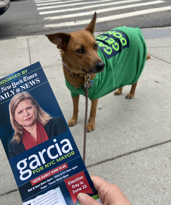 Around this time last year New York City was bubbling with anticipation as democrats began declaring their candidacy for mayor. As a former resident and forever-fan of NYC I was thrilled when The Strategy Division came to me with their client -a relatively unknown bureaucrat out of NYC's sanitation division with a reputation for problem solving and crises management: Kathryn Garcia. Kathryn came into the running as an unknown and the initial approach with print material was to introduce her to the public. We started with a simple lit piece - the size of a rack card, it could easily be slipped into envelopes or handed to people while canvassing. The camera loves Kathryn and I had a stellar selection of professional photos from which to choose. The one we ultimately used emits strength and competency. The piece flew out the doors and into hands and was continually reincarnated as the campaign grew and endorsements were earned. When the NY Times and the Daily News came forwarded with their support we made the most of it - emblazoning their quotes everywhere. Pictured below are five different print runs over the course of the campaign. 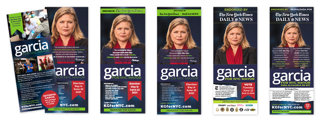 Incidentally, the original logo - which had already been created by the time I was invited to the team - was hard to read in many applications. The pieces above show a slight morphing of the logo to which I added a stroke in later pieces, which helped solve the issue. The lit piece did so well we opted to resize it for the digital campaign. 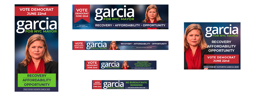 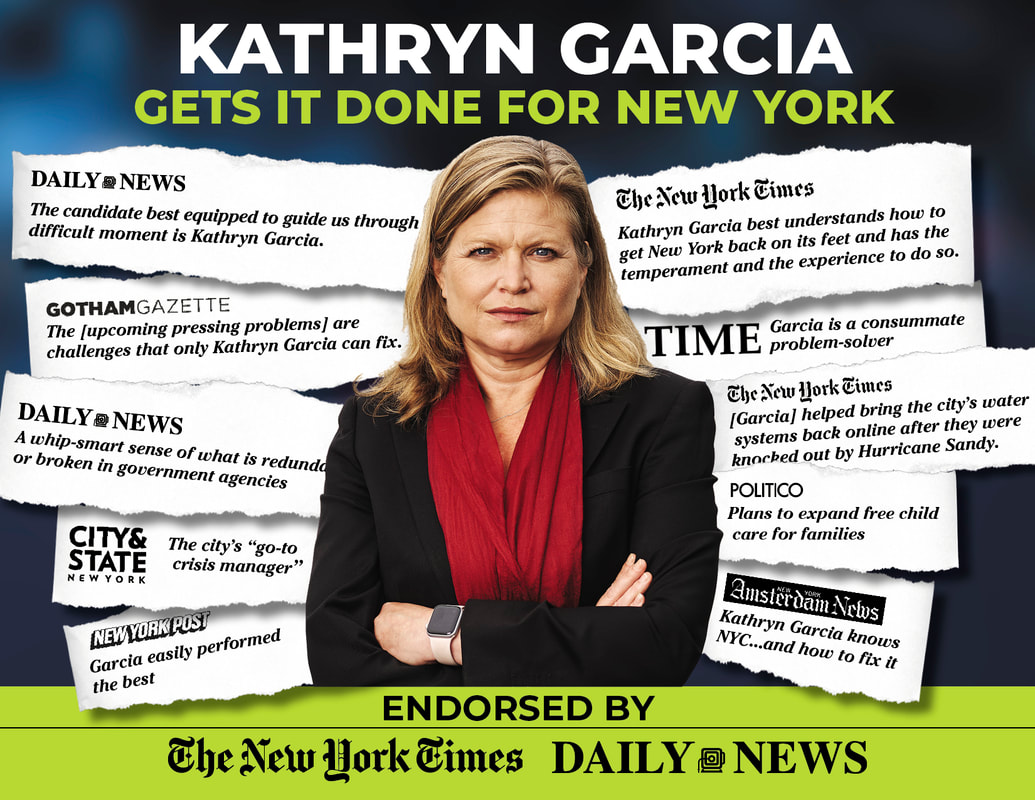 The hand-outs and digital push were balanced with a robust print mail effort. No less than 20 mailers were designed and sent out in three months leading up to the primary election. Most pieces were flats - 8.5x11 - essentially large postcards. As noted, endorsements were an important part of legitimizing Garcia as a strong mayoral candidate and we made use of them with quotes torn directly from the publications. This was my favorite (left/above), but you can see more in the images below. 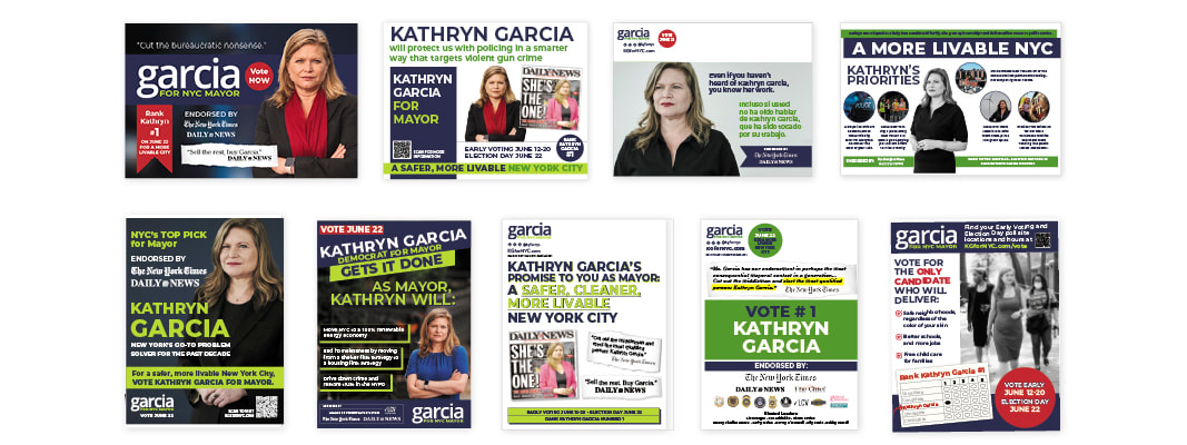 What is a political campaign without swag? Veering slightly away from brand by opening the design up to new fonts and angles (literally) we created shirts, stickers, and mugs. My interpretation of the merchandise was somewhat different than the outcome (perhaps I wouldn't have chosen green t-shirts) but people loved them and canvassed happily while wearing them. 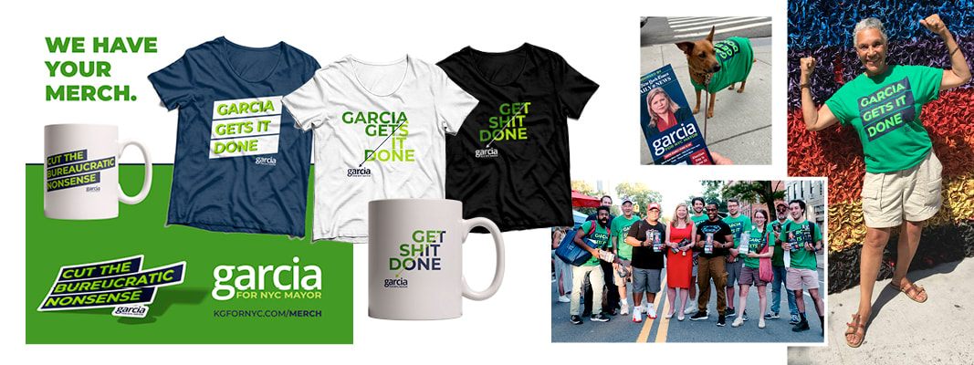 Somewhere along the way it was decided that Kathryn needed a vehicle to travel between the Burroughs and "could we brand it?" Why not? A van wrap was born and it cruised the streets of New York City during the final weeks of the campaign. 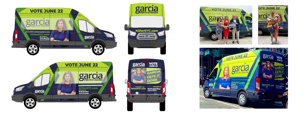 The Garcia for Mayor campaign was multifaceted and broad and succeeded in creating media interest and name recognition. It was a tight race with a new "ranked voting" system in which she placed second by a single percentage point. Despite the loss, Kathryn Garcia's effort didn't go unnoticed and last fall, Governor Kathy Hochul appointed her to Director of State Operations. While her new position might not warrant a branded van, Kathryn Garcia is on her way up and the race for Mayor was a big step on that ladder.
The Daily podcast had a wonderful episode today outlining why this is such an important project and how it's working out for Evanston and the 5th Ward. I highly recommend listening. (click here)
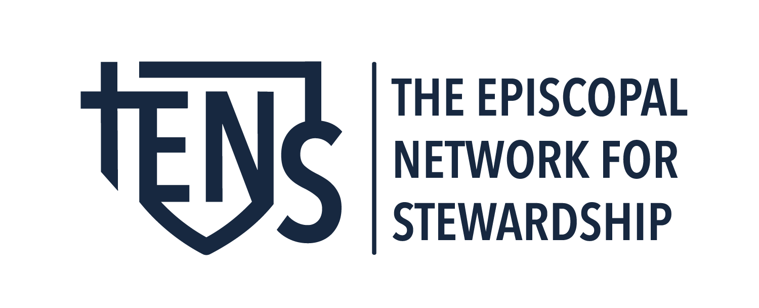
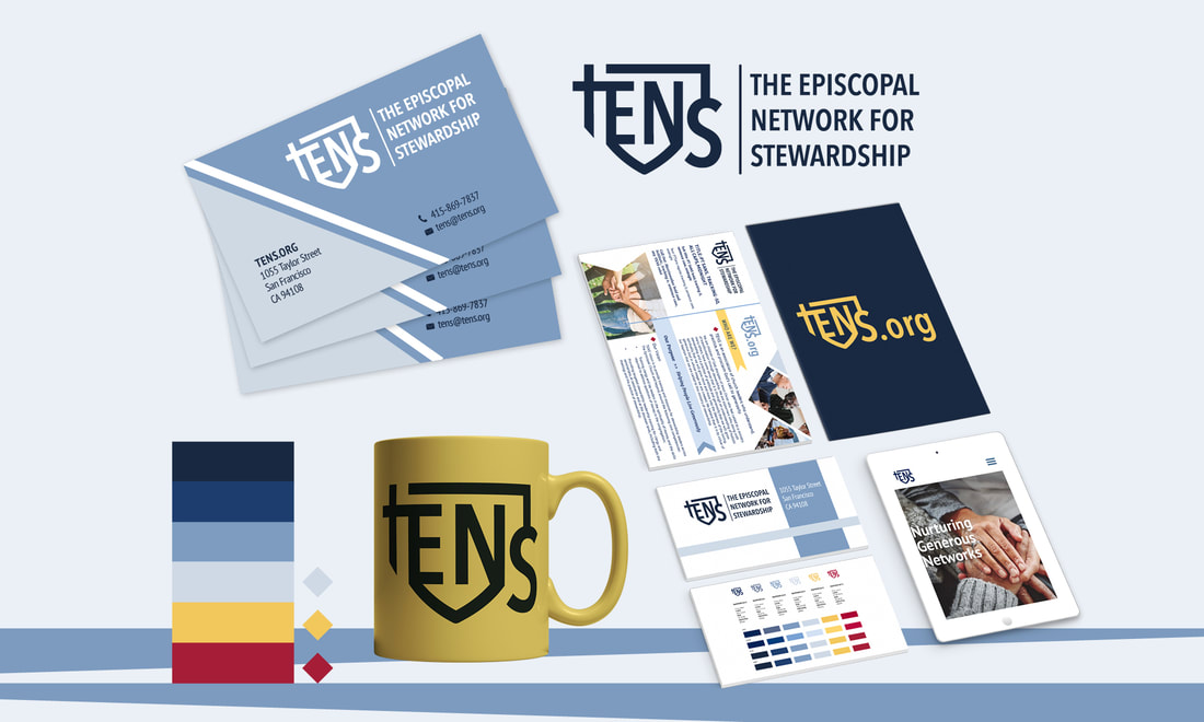 A strong brand identity offers assets that make it easy to create consistent printed materials and digital graphics; the result is wide spread recognition among constituents. With a guide that includes color, shapes, and design examples, an organization or company can feel confident that their hard earned brand will not become watered down as it used by designers and others over time. The work we recently did on the TENS rebranding is a great example of how this works. The Episcopal Network for Stewardship works to provide training, encouragement, nurture, and support to the broader Episcopal community by offering resources and tools for download from their extensive online library. Upon his appointment, new Executive Director Davey Gerhard, decided it was a perfect time for a brand refresh and asked me to take on the project. We start all logo/brand re-designs by asking a lot of questions and from these I extrapolate the phrases and words that are used most often. In the case of TENS, we heard a lot of talk about "connection", "networking" and "generosity." When discussing how they wanted the logo to look, phrases that included "modern", "not busy", "flexible", and "like the episcopal shield" were tossed around consistently. From these conversations we started sketching and went through several versions and concepts before finalizing a design that satisfied the needs of the board, staff, and constituents. The goal of the TENS logo is to make the connection between faith, connection, tradition, and generosity while conveying a sense of modern competency and confidence. Here is a breakdown of the meaning behind the TENS logo mark. 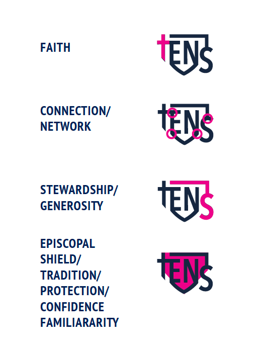 The logo mark could be "locked up" in any number of configurations depending on the space allotted. The preferred lockup is the mark to the left and a dividing rule separating from the type treatment on the right, however, other lockup combinations can be used including a website version space is particularly limited.
The color choices for TENS are as important as the logo itself and are an intentional part of its personality. We established four primary colors in shades of blue and two secondary colors for contrast and emphasis. A mood board does a great job of showing how these colors come together to form a cohesive brand.   Our font choices are a simple yet elegant sans serif (PT Sans) and a rounded serif (Merriweather) - both easily accessibly via google and adobe to allow consistency among the many constituents using the branding. In addition to color and fonts, we also developed icon and graphic element usage suggestions - all elements should reflect the logo mark with triangular edges, diamond shapes, and ribboned ends. Image boxes can be shaped to reflect these design elements. Whenever possible we try to avoid circles and ellipses. 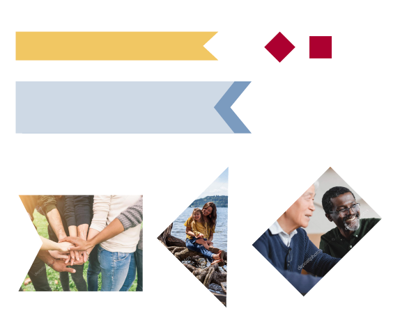 The importance of a brand guide for creating a way to maintain consistence over all outlets for marketers, publicists, accountants, and other designers cannot be underestimated. Do you have one?
|
AuthorCori Kesler 
Archives
June 2022
Categories |

 RSS Feed